Wednesday, August 11, 2010
Friday, January 9, 2009
Anamorphic Lens–Flare Creation
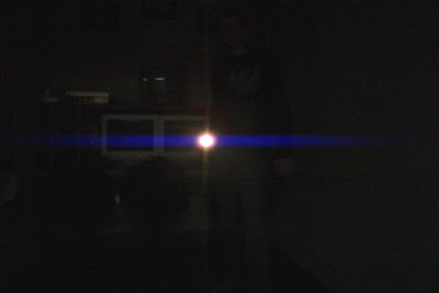
 Happy New Year to everyone! Sorry I'm a bit late on this, but so it goes... This is a follow–up on the Lens–Flare promise. As you know, it only uses the effects that are native to After Effects. In fact it only uses one effect: Glow.
 This will work wonders for you if you want to just add a little more style on a certain shot for a client. Here's how:
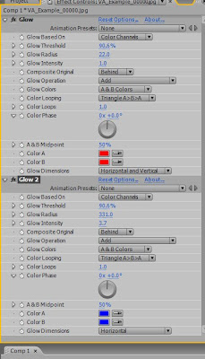
1. After you have your comp ready, create a new adjustment layer (not necessary, but recomended). Apply Effect, Stylize, Glow. Duplicate the glow and turn off the second instance.
2. You need to create the core. Set the A and B colors both to a nice red color of your choosing. Change the Glow Colors to A & B Colors (the color looping doesn't matter since they're the same colors). Change the glow threshold to something very high (you'll have to eyeball this for your shot, every image will be different), usually the 80's or 90's does the trick. Change the Glow Radius to what ever looks good for a core; you'll find that somewhere around 20 works most of the time. Lastly you can change the Glow Intensity to whatever you desire.
3. Now we create the blue horizontal streaks. Turn on the second instance of Glow and change both of the red colors to blue (or any other color if you want). Here's the key: change the Glow Dimensions from "Horizontal and Vertical" to "Horizontal" only. Change the radius to someting very high, until it flares across the screen. Lastly bring up or down the glow intensity. Voilà!
4. If you used the adjustment layer, you can change the opacity of that to further sell the effect. RAM preview and you'll see that with no keyframes the glow will automatically follow the highlights and turn off (sort of) when there should be no flare.

Obviously this isn't perfect and shouldn't be substituted for the real thing. Not all highlights would create a flare, the shape and colors aren't entirely correct, etc... But for five minutes of work and no extra money spent, this is great. As you know from the original comparison, this technique can work better that some plugins that do it automatically for you. It's all a matter of adjusting the colors, the radius, the intensity, etc to come up with what looks good to you.
Hope you enjoy this!
Monday, December 22, 2008
Merry Christmas!
Just wanted to wish you all a Merry Christmas and Happy New Year.
It has been an awesome past year, so thank–you all for making this a great place to be. After the holidays we are planning to really get moving, so be prepared!
For now, here's a list of the 5 coolest gifts to give to that vfx enthusiast you know:
 While not an entirely necessary upgrade, there are many new features that you can find interesting such as the new Flowchart view, Quicksearch, Importable 3D layers, and a full version of Mocha AE.
2)What would go along with your new software better than a new book on how to use it?
 Adobe After Effects CS4 Visual Effects and Compositing Studio Techniques
may sound like a mouth–ful, but Mark Christiansen's previous books have been great, so I would highly recommend this read. As usual, it looks at AE through the eyes of a VFX artist, and explains useful tips on compositing, it's not just a second manual to the software.
3) Some new typography.
 One of my favorite fonts is available through veer.com. The font featured above is called Walbaum, and is perfect for professional work.
4)A Wacom Tablet.
 If you've ad the opportunity of working with one of these in the past you know that they are worth every penny of the $400 you will spend on it. If you don't know when you'd use it, watch this tutorial for some jump–start ideas.
5) Evolution by Video Copilot.
 This (in my opinion) is by far the best product offered by Andrew Kramer. He includes around 170 HD design elements that look absolutely wonderful. Never spend the time in Illustrator again designed these high–quality "flourishes." These are pre–animated and ready to use. Two thumbs up!
Friday, December 5, 2008
Anamorphic Lens–Flares
Lately I've been playing around with ways to create lens flares in After Effects without using plug-ins or generators. I've used everything from solids to the glow plugin to motion tracking, etc. Here are two examples: one was created with a very popular plugin, and the other was created in after effects without any plugins; see if you can guess which is which:

 Notice how only the top one has a core, the bottom one does not...the top is the one that I created in After Effects, the other was made using another popular plug-in. For three minutes of work it looks very good. What you can't tell by the pictures though, is that the top one has much more smooth movement than does the bottom when it's applied to video.
There may be a how-to post or maybe even a tutorial that deals with this sort of thing in the near future. Let me know what you guys think!
